phone

image

Factory Trained and Certified RV Service Technicians.

Come experience the difference at Bakersfield RV Center. Friendly and knowledgeable service personnel. Fast and reliable RV repairs performed by factory trained and certified RV service technicians.

Read More

image

RV Service and Repair For All Makes and Models.

Whether you own a Motorhome, Travel Trailer, Tent Trailer, Truck Camper, Toy Hauler, Speciality Trailer, Horse Trailer, or Utility Trailer we can provide quality services at affordable pricing.

Read More

image

Save Money - Lowest Labor Rate In Bakersfield.

Stop paying for other service centers ridiculous overheads and inefficiencies. Our organized, efficient operations allow us to offer you the lowest RV labor rate in Bakersfield without compromise.

Read More

image

No Appointments Necessary  Quick Turnaround On Repairs

Get your Motorhome, Travel Trailer or RV in for repairs quickly. Get your desired RV repairs and/or Services completed in a timely manner.

Read More
  • icon Professional RV Service & Repair
  • icon Servicing All Makes & Models
  • icon Lowest Rates In Bakersfield
  • icon Quick Repair Quality Services
Over 30 Years of RV Experience

The owners of Bakersfield RV Center have more than 30 years of RV experience.

READ MORE

No Diagnostic Fees

No up front or flat fees for typical diagnosis.

READ MORE

Extended Warranties Welcome

We work with all extended warranty companies.

READ MORE

Insurance Claims Welcome

Fusion Menu is primarily a javascript enhanced CSS dropdown menu, that combines standard suckerfish type functionality with animations, transitions and other advanced effects provided by Mootools; in addition to other MegaMenu features such as multiple columns.

READ MORE

Lorem ipsum dolor sit amet, consectetur adipiscing elit. Donec sit amet nibh. Vivamus non arcu. Lorem ipsum dolor sit amet, consectetur adipiscing elit. Etiam dapibus, tellus ac ornare aliquam, massa diam tristique urna, id faucibus lectus erat ut pede. Maecenas varius neque nec libero laoreet faucibus. Phasellus sodales, lectus sed vulputate rutrum, ipsum nulla lacinia magna, sed imperdiet ligula nisi eu ipsum. Donec nunc magna, posuere eget, aliquam in, vulputate in, lacus. Sed venenatis. Donec nec dolor vitae mauris dapibus ullamcorper. Etiam iaculis mollis tortor.

In erat. Pellentesque erat. Mauris vehicula vestibulum justo. Cum sociis natoque penatibus et magnis dis parturient montes, nascetur ridiculus mus. Nulla pulvinar est. Integer urna. Pellentesque pulvinar dui a magna. Nulla facilisi. Proin imperdiet. Aliquam ornare, metus vitae gravida dignissim, nisi nisl ultricies felis, ac tristique enim pede eget elit. Integer non erat nec turpis sollicitudin malesuada. Vestibulum dapibus. Nulla facilisi. Nulla iaculis, leo sit amet mollis luctus, sapien eros consectetur dolor, eu faucibus elit nibh eu nibh. Maecenas lacus pede, lobortis non, rhoncus id, tristique a, mi. Cras auctor libero vitae sem vestibulum euismod. Nunc fermentum.

Mauris lobortis. Aliquam lacinia purus. Pellentesque magna. Mauris euismod metus nec tortor. Phasellus elementum, quam a euismod imperdiet, ligula felis faucibus enim, eu malesuada nunc felis sed turpis. Morbi convallis luctus tortor. Integer bibendum lacinia velit. Suspendisse mi lorem, porttitor ut, interdum et, lobortis a, lectus. Phasellus vitae est at massa luctus iaculis. In tincidunt.

Nullam eget neque. Nullam imperdiet venenatis ligula. Integer a leo. Nunc consectetur. Maecenas sem. Proin vulputate, massa vel volutpat laoreet, purus erat pretium ligula, eget varius arcu nibh sed libero. Fusce ante. Nullam interdum aliquet metus. Ut ultrices vestibulum tellus. Praesent quis erat. Nam id turpis sit amet neque cursus luctus. Cum sociis natoque penatibus et magnis dis parturient montes, nascetur ridiculus mus. Quisque id tortor. In vitae sapien. Nunc quis tellus.

Category: Demo Articles

Access the Style Control settings from Admin → Extensions → Template Manager → rt_camber_j15 → Settings.

Simple configure the options, then save and Gantry will automatically load the modified preset to your site.

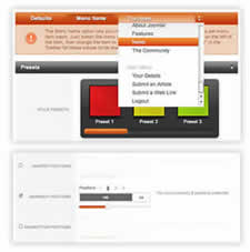
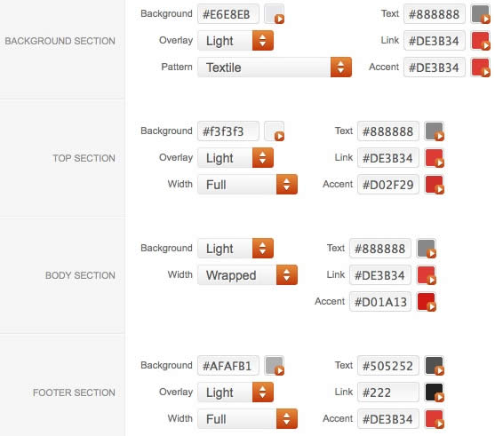
Color Chooser Settings

Image

A Color Chooser template uses CSS color values, combined with transparent overlay images, to determine its color and style. Therefore, you can change the entire color scheme via the Gantry Administrator. The available options are outlined below:

  • Background: Background, Overlay (Light/Dark), Pattern, Text, Link & Accent
  • Top: Background, Overlay (Light/Dark), Width (Full/Wrapper), Text, Link & Accent
  • Body: Background, Overlay (Light/Dark), Width (Full/Wrapper), Text, Link & Accent
  • Footer: Background, Overlay (Light/Dark), Width (Full/Wrapper), Text, Link & Accent

Other Style Settings

  • Load Transition: On - Off; Enable or disable the page loading transition animation effects
  • Fixed Header: On - Off; Enable or Disable a fixed floating header section.
  • Read More Style: Button and Link; Set the read more link styling for the template
  • Web Fonts: On - Off, Google Font Directory; WebFonts allow you to use 3rd party WebFonts from providers such as Google. You must SHOW then APPLY before the new fonts will show up in the Font Family dropdown.
  • Font Settings: Select a font family from the available options and also choose a default font size
    • Font Family: Camber, Geneva, Optima, Helvetica, Trebuchet, Lucida, Georgia, Palatino, or Various Google Fonts (dropdown)
    • Font Size: Default, Extra Large, Large, Small, Extra Small (dropdown)


Assigning a Style to a Specific Page

Image

With Gantry, the ability to assign a certain style to an individual page has never been easier and/or more efficient. Just follow these simple steps:

  • Go to Extensions → Template Manager → rt_camber_j15
  • Select the Menu Items tab - located in the right column of the page in the orange box
  • Choose a menu item you wish to assign a different style to
  • Select your preset of choice from the Presets → Style Presets parameter area
  • Configure the Settings area to your personal preferences
  • Save

Gantry Framework: Per Menu Item Controls

Category: Demo Articles

Gantry sets the dimensions of the logo, so CSS modification is unnecessary.


Step 1 - Open the File

Logo

  • Open the logo-source.png file in Adobe® Fireworks.
  • In the right column, find Layers. Select the Web layers directory and click the eye icon to the left of the logo slice (the green object). This will make the slice invisible so you can edit the file.


Step 2 - Text/Slogan/Icon Editing

  • Double click on the logo text. Now you can edit the text of logo to your choosing. Edit the icon as desired.

Logo Logo Logo


Logo

Step 3 - Slice Modification

  • Reactivate the Slice in the Web Layers column, this will place a green rectangle over the logo image. Change the size of the slice (or move it) to match the new size if applicable.


Logo

Step 4 - Export

  • Now you will want to export the logo. Right click on the image slice and select Exported Selected Slices... from the contextual menu. Proceed to export it to your computer for uploading.


Step 5 - Multiple Frames/States

  • If there are multiple logos for a template, they are located in Frames or States within Fireworks.

Logo Logo

 
Category: Demo Articles

Please ensure you are using the latest version of RokNavMenu, available here.

Configuration

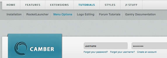
Go to Extensions → Template Manager → rt_camber_j15 → Menu Control → Set Menu Type, to find all the parameters for Fusion Menu and Splitmenu, such as transitions, duration and sublevel position.

Descriptions of each template parameter can be seen when you mouseover the label of each option.


Fusion with MegaMenu

image

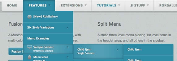
Fusion Menu is a menu theme of the RokNavMenu extension, the addon that drives all RocketTheme template menus. It is primarily a javascript enhanced CSS dropdown menu, that combines standard suckerfish type functionality with animations, transitions and other advanced effects powered by Mootools.

  • 1/2/3/4 Column Modes
  • Custom Column Widths
  • Custom Menu Width
  • Menu Item Grouping
  • Item Distribution Controls
  • Animation Controls
  • Transition Controls
  • Duration/Delay Controls
  • Opacity Controls
  • Per Item Styling
  • Inline Modules
  • Inline Positions
  • Menu Item Subtext
  • Menu Item Icons
 

All Menu Items can be edited from Admin → Menu → Menu NameMenu Item.

Basic Fusion Parameters

  • Subtext is the option that allows you to insert additional text to the Menu Item Title. There is separate styling for this, making it useful for adding brief descriptions to menu items.
  • Menu Icon is the option that allows you to insert an inline icon / image to the Menu Item.

Advanced Fusion Parameters: Columns

Menu Columns

Columns of Child Items allows you to determine how many columns the Fusion dropdowns are presented in. You can have anywhere between a single dropdown to a four column dropdown.

Item Distribution

Item Distribution allows you to control how the menu items are ordered in the dropdowns:

  • Evenly: If there are 7 menu items in 3 columns, Fusion will allocate a 3,2,2 distribution - trying to equalize each dropdown.
  • Order: If there are 7 menu items in 3 columns, Fusion will allocate a 3,3,1 distribution - maintaining the item ordering.
  • Manually: Determine the exact distribution of items across all columns in the Manual Item Distribution field. For example, if there are 7 menu items in 3 columns, you can specify a 4,2,1 distribution.

NOTE: If your Columns of Child Items setting is configured to be 2 or more columns, you will need to manually set the column widths and distribution, as outlined below. The default is 180px which is too small for multiple columns.

Drop-Down Width (px)

Drop-Down Width (px) determines the total width of the dropdown, regardless of how many columns are shown. This option is to be used in conjunction with Column Widths (px)

Column Widths (px)

Column Widths (px) determines the width of each Column. Separate each width by a comma. The final column's width is determined automatically. This option is to be used in conjunction with Drop-Down Width (px)

Below are some example configurations:

  • Drop-Down Width: 480px: 160,160. Fusion automatically calculates the final width as 160, so in practise, 160,160,160 is the actual distribution.
  • Drop-Down Width: 600px: 160,160. Fusion automatically calculates the final width as 280, so in practise, 160,160,280 is the actual distribution.

Advanced Fusion Parameters: Groupings

What is Grouping?

Group Child Items changes the behaviour of child items in the dropdown menus, instead of creating a dropdown for the immediate sublevel, this option places them inline. See below for an illustrated example of the differences:

Configuration

NOTE: Grouping cannot be applied to root items, only child items.

Set Group Child Items to Yes to activate the mode. The sublevels well then appear below the parent menu item in a categorical type structure.

Advanced Fusion Parameters: Modules

Fusion is now capable of loading individual modules or entire module positions inside its dropdowns.

  • Inline Modules: Set Child Item Type to Modules to load all modules setup on your Joomla site in a list. Select the module you wish to display in the dropdown.
  • Inline Positions: Set Child Item Type to Modules Positions to load all module positions on your Joomla site in a list. Select the position you wish to display in the dropdown.


Splitmenu

image

A static menu system that displays 1st and 2nd level items in the main horizontal menu and further children in the Sidebar.

  • Subtext is the option that allows you to insert additional text to the Menu Item Title. There is separate styling for this, making it useful for adding brief descriptions to menu items.

Code Modification: Remove the Menu in the Title

Open /templates/rt_camber_j15/html/modules.php and change:

<?php echo $menu_title_item->name.' '.JText::_('Menu'); ?>

To

<?php echo $menu_title_item->name; ?>


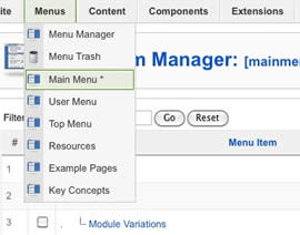
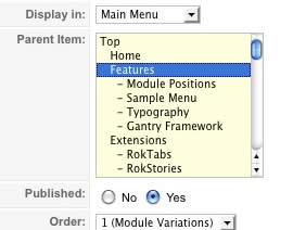
How to create Child / Sublevel menu items

Go to Admin → Menu → A MenuA Menu Item → Select a Parent Item, and it will appear as a child of it.

Image Image

Category: Demo Articles
  • Top Features
  • Tutorials and Guides
  • Integrated Extensions

Styles

15 Variations

Control styles via Color Chooser.

Color Chooser provides a rich administrative interface for controlling the template's styles, with a interactive mootools powered popup to select colors, whether for the background or text colors, as well as selectors for patterns and overlays.

Read More
 

Gantry

Framework

Powering the template core.

Gantry provides a range of features, from the dynamic 960 Grid System, to the advanced user interface, per browser or platform CSS/JS support, or per-menu-item configurations, plus a plethora of other advanced features..

Read More
 

Menus

Two Options

Fusion Menu and SplitMenu.

Choose between the two available menu options, either the javascript enhanced CSS dropdown system, Fusion with MegaMenu features; or the static horizontal and sidebar menu, triple level Splitmenu.

Read More
 

Install

Instructions

Learn how to install the template.

Remember to download all the necessary files, and determine which are installable, and which are for alternative uses such as the Adobe® Fireworks PNG sources which are for image editing only.

Read More
 

Logo

Modification

Adobe ® Fireworks PNG Sources.

Customize the logo, or any other image element in the template with the accompanied Adobe® Fireworks PNG sources. The guide available provides step by step instruction on editing the source.

Read More
 

Forum

Guides

Member Only Tutorials & Guides.

A range of forum based tutorials to assist in understanding the template features, as well as a range of guides in customization or transplanting old/new features. These are available to club subscribers only.

Read More
 

Tabs

RokTabs

Tabbed Content Module.

RokTabs is a tabbed content module, standalone and sporting its own themes (light and dark). Content is transitions, either by fade or scroll, and is powered by mootools..

Read More
 

Tweet

RokTwittie

Twitter Display Module.

RokTwittie is a module that integrates Twitter into your Joomla site. Display tweets of any username, or even by search terms, as well as your profile information and various other elements from Twitter itself.

Read More
 

Slider

RokNewsPager

Sliding Content Module.

RokNewsPager is an article previewer and rotator. It displays content articles, in a summarised form and, using mootools based javascript transition, rotates through a series of pages displaying articles in a contracted list or accordion format.

Read More
 

RokGallery Extension

Custom Tag-Based Architecture

RokGallery is an advanced gallery, with non-destructive slice editing, and other features typically associated with native apps.

Read More

RokGallery Extension

Custom Tag-Based Architecture

RokGallery is an advanced gallery, with non-destructive slice editing, and other features typically associated with native apps.

Read More